Creative Brief Template for Better AI Images
PhotosStyle Team
9/5/2026
“Make a beautiful product image” leaves almost every decision open. A bright studio shot, a bathroom scene, and a dramatic still life might all satisfy that request. Only one may suit the launch you have in mind.
A creative brief gives those decisions a home: what the image must achieve, what must stay recognizable, and what the first round should explore. Use the template below to prepare a visual project, then bring it into PhotosStyle Creator to generate and refine images in the same conversation.
Copy This Creative Brief Template
Replace the brackets with your project details. Short, specific answers are enough; delete fields that do not apply.
Project goal: [what this visual project should achieve]
Audience: [who will see the images]
Main message: [the one idea the viewer should understand]
Where images will be used: [product page, social post, email, etc.]
Main subject: [product, person, object, or scene]
Must keep: [identity, shape, colors, materials, important details]
Can change: [background, lighting, props, framing]
Visual mood: [two or three compatible qualities]
Color and lighting: [palette, light direction, shadow quality]
Composition: [subject placement and space for later text]
Reference images: [what each attachment should influence]
Images needed: [a numbered list of first-round outputs]
Aspect ratios: [1:1, 9:16, 16:9, 4:3, or 3:4 for each output]
Avoid: [unwanted objects, styles, text, or alterations]
Approval criteria: [what you will check before accepting a result]
For a team project, keep the deadline, budget, and reviewer in your planning document as well. Creator needs the visual instructions; it does not manage those approvals or your publishing schedule.
Copy the completed brief, open PhotosStyle Creator, sign in when prompted, and paste it into the input box. Opening this link does not automatically fill in the template.
Fill It In: A Skincare Product Example
Imagine a small skincare business preparing launch visuals for a frosted sage-green bottle. The task is to find a calm, recognizable visual direction before producing a whole campaign.
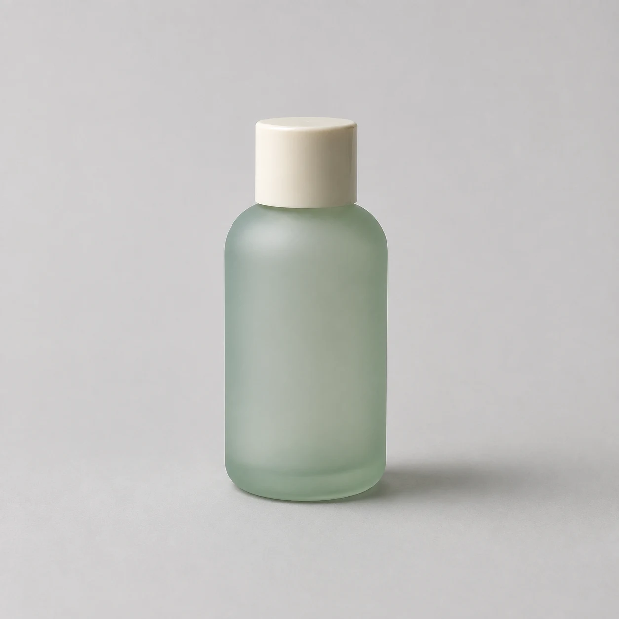
The fictional product and comparison images in this article are AI-generated teaching illustrations. They are not screenshots or recorded outputs from a Creator session, and they do not establish a measured improvement in results.
Here is the completed brief:
Project goal: Choose a visual direction for a skincare product launch.
Audience: Adults who prefer a simple, understated skincare routine.
Main message: A calm moment in an everyday routine.
Where images will be used: Product-page supporting images and social posts.
Main subject: The bottle in reference image 1.
Must keep: Sage-green frosted glass, rounded shoulders, bottle proportions,
and the ivory cylindrical cap. Keep the entire bottle visible.
Can change: Background, supporting props, lighting, and placement.
Visual mood: Calm, tactile, understated.
Color and lighting: Warm ivory, sage, and pale stone; soft side lighting.
Composition: Make the bottle the focal point. Leave room for later copy.
Reference images: Image 1 defines the product, not the final background.
Images needed:
1. Clean studio direction with no props.
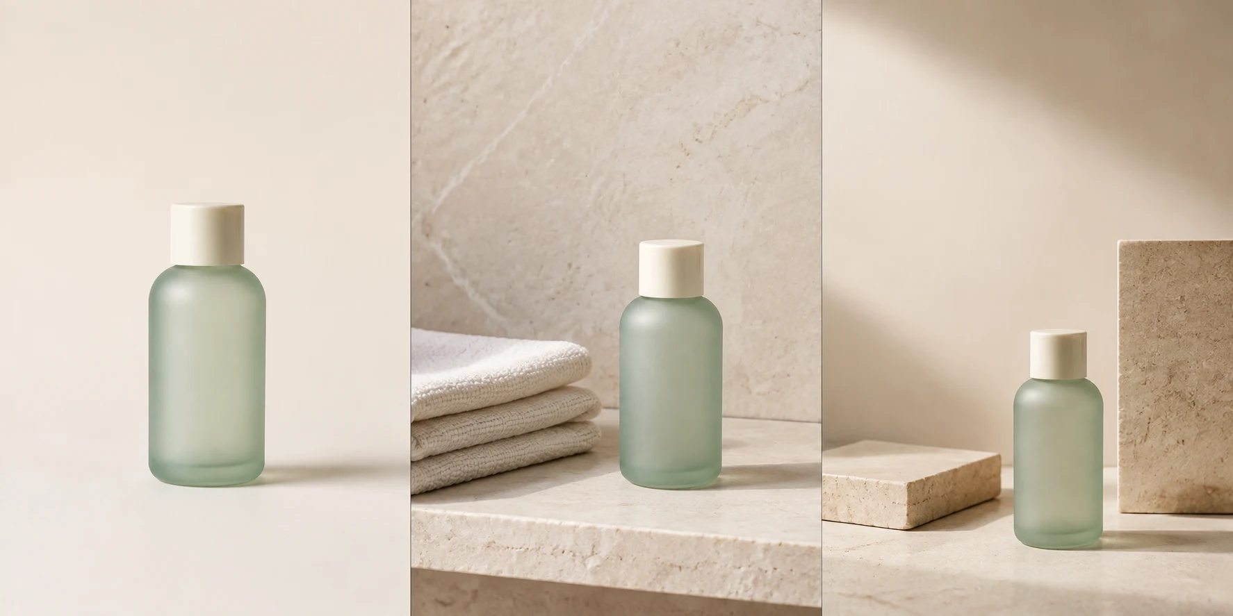
2. Everyday bathroom-shelf direction with a folded ivory towel.
3. Editorial still life with two simple stone blocks.
Aspect ratios: 1:1 for all three directions in this first round.
Avoid: New labels, invented claims, extra bottles, neon colors, watermarks.
Approval criteria: Recognizable bottle; convincing material; clear focal
point; useful text space; a direction that suits the intended audience.
For your own product, replace this fictional description with its actual features. An unlabelled teaching example does not demonstrate reliable reproduction of packaging text or logos.
Make the Important Fields Specific
Separate what must stay from what can change
“Keep the product” is easy to interpret too loosely. Name the cap, silhouette, finish, and important colors. Then explicitly allow changes to the setting and composition. This gives you a basis for reviewing the result even when generation does not preserve every detail.
For a portrait, the equivalent might be facial identity and hairstyle versus background and lighting. A reference is guidance, not a guarantee of exact reproduction.
Give each reference a job
Use a clear, unobstructed photo for the subject. If you add another reference, explain whether it supplies a material detail, a color palette, or a lighting mood. For example: “Image 1 defines the bottle; image 2 is only a lighting reference. Do not copy its packaging.”
Turn mood words into visible choices
“Premium” can mean many things. “Warm ivory background, soft side lighting, restrained shadows, and few props” gives you visible criteria to judge. If two adjectives pull in different directions, decide which takes priority.
Name the outputs before asking for them
Three directions answer “Which look should we choose?” Three placements answer “How should the chosen look work in different spaces?” In this example, keep the first-round ratio the same so that format changes do not distract from comparing visual approaches.
Use the Brief in Creator
- Copy your filled-in brief and open Creator.
- Sign in when prompted, paste the brief, and attach the references you described.
- Submit the request. If Creator asks for clarification, resolve it before generating.
- Review any proposed plan, image count, and credit information shown before confirming generation.
- Compare the images against your approval criteria and choose a direction to refine.
Creator supports up to four image tasks per generation round. Keep a larger campaign in separate rounds, and do not assume that every brief will produce the same plan or credit cost.
From left to right, the illustrations emphasize product clarity, everyday context, and an editorial composition. Choose according to the placement and message. Before judging atmosphere, check whether the bottle shape, cap, and material still match the reference.
Request One Focused Revision
Suppose the stone still life fits the mood, but the props compete with the bottle. Continue in the same Creator conversation and identify the result you want changed:
Revise the third image. Keep the sage-green frosted bottle, ivory cap, warm palette, and soft side lighting. Remove both stone blocks. Make the bottle a little larger and place it toward the lower right, leaving the upper-left area clear for a headline. Keep the entire bottle visible. Do not add text.
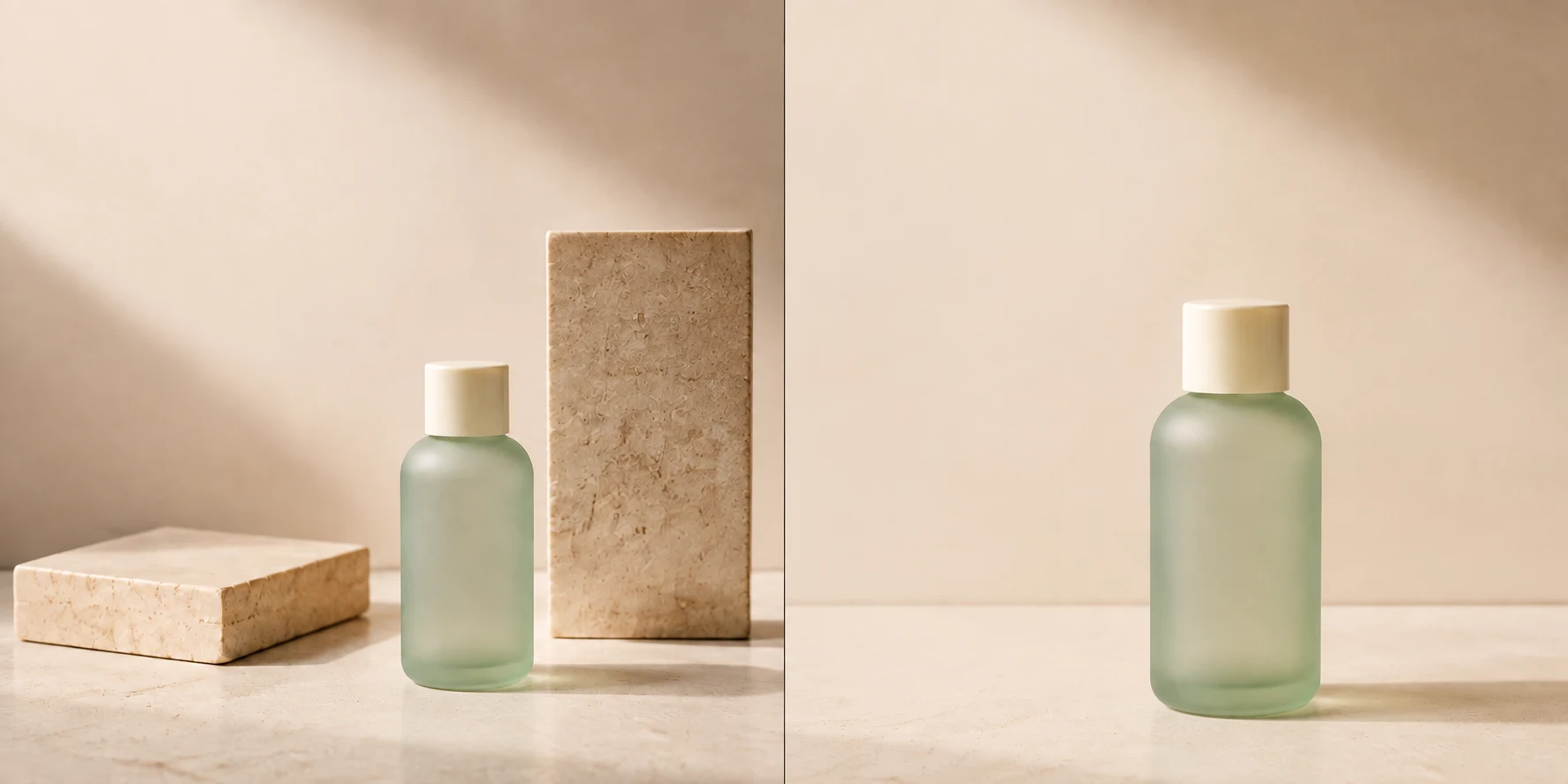
This comparison illustrates the requested change, not a guaranteed editing result. Review product details again after every revision; simplifying the background can still introduce unwanted changes elsewhere.
A reusable feedback structure is:
Revise: [which result]
Keep: [the features already working]
Change: [one clearly bounded goal]
Do not change: [critical identity or product details]
Accept when: [a visible condition you can check]
Once a direction works, ask for one new use at a time: “Adapt this direction to 16:9, keep the bottle fully visible on the right, and leave the left side clear.” Creator supports 1:1, 9:16, 16:9, 4:3, and 3:4. These are aspect ratios, not guaranteed pixel dimensions. Handle exact canvas sizes and final typography in your layout tool.
Check the Images Before Using Them
- Compare the subject with the original reference: shape, proportions, material, and color.
- Inspect any logo, label, face, or small detail that matters to the project.
- Check that the focal point and text space work at the intended viewing size.
- Verify generated wording and add exact product or promotional copy during final layout.
- Download the approved images and check the destination's final size requirements.
- Save the approved brief and useful feedback alongside the images for the next round.
If a result misses the brief, describe the mismatch rather than adding a long list of unrelated style words. For example, “The cap became metallic; restore the matte ivory finish” is easier to assess than “Make it more on-brand.”
For an event project, use the same brief structure with an event name, audience, subject, and information hierarchy. Our AI flyer workflow explains how to develop that direction into promotional visuals.
Frequently Asked Questions
How is a creative brief different from a prompt?
A brief records the purpose, constraints, and acceptance criteria of the project. A prompt asks for a specific action. Your filled-in brief can serve as the first prompt; later prompts should identify a result and the change needed.
Do I need to fill in every field?
No. For a small project, start with the goal, subject, must-keep details, outputs, and approval criteria. Add other fields when they resolve a real ambiguity.
Can I start without a reference image?
Yes, a concept can begin with text. Attach a clear reference when a particular product or person needs to remain recognizable, then inspect the generated details carefully.
Is this template free, and does Creator use credits?
You can copy the template from this article. Image generation in Creator uses credits; follow the current plan and credit information shown in the product rather than assuming a fixed price for this example.
Can I return to the same project?
Sign in to use Creator and keep your project history. Continue in the same session to retain the conversation context, repeating critical constraints when they matter to a new request.
Start with Your Own Brief
Fill in the template, attach a purposeful reference, and request a small first round. Then use your approval criteria to choose what to keep and what to change.